Creating an excellent product landing page should be high up on your priority list when you’re designing your ecommerce site. The ecommerce world is extremely competitive and you need to make sure you’re in with a fighting chance of converting those visits into leads and sales.
Many online retailers miss out on successful conversions because they haven’t optimized their landing pages.
Doing this is crucial: if your would-be customers aren’t clicking on the ‘buy’ button, you’ve essentially wasted all of that time and money you’ve spent building traffic to your website.
There are a number of ways you can create the perfect landing page to ensure you are optimizing your conversion rates — have a look at our handy tips below to get started.
What is a product landing page?
We’ll start with the basics — what is a landing page? It’s a page of your website that a visitor arrives at after clicking on a link or an ad. It’s built for a specific purpose; for example, a product landing page will promote a particular product or a service, and will contain information on this product, as well as a call to action (CTA) to purchase it.
Your product landing page should have the main intent of driving traffic towards a conversion — turning that visitor into a customer. But the question is, how do you make a great product landing page?
Do plenty of market research before you get started
When you’re planning the perfect product landing page, you need to do plenty of research. Focus on two main areas: customer research, and competitor analysis.
First — your potential customers.
You need to ask yourself some questions; who is your audience? What are they looking for? How did they get to your product landing page? What do you want them to do?
Identify your target customers or clients. If you know who your specific target group is, you can start aiming your product page towards them. To do this, you need to understand your target audience, so you’ll have to do plenty of research on their likes and dislikes, and what they want and need. Use social media, and tools like Google Trends to get you going.
Once you have a better understanding of what makes your consumer demographic tick, you’ll be able to design a product landing page that appeals to them, and has a way higher chance of converting.
Second — your competitors.
Who are your most successful competitors? What are they doing well?
Check out the competition. You need to see what they’ve done well, and how they’ve created a dazzling product landing page to convert leads into sales. This will give you a good indication of what you’re aiming for with your product landing page (although remember that each online store is different). There are plenty of online tools that will help you to analyze the competition.
Layout is key — don’t clutter your product landing page
When you’re creating your product landing page, you need to think about how it’s going to perform visually. There are some things you should definitely do, and some you definitely shouldn’t:
Don’t make your product page too cluttered — you don’t want to overwhelm the customer with lots of text and lots of irrelevant pictures. If you overload your page, you’ll not only slow down the loading time — thus decreasing your chances of converting — but your visitor will also end up confused and disinterested.
You need to have a simple and clear page layout.
Give your product landing page a clean, crisp design; have a consistent, plain background/plenty of whitespace and a minimalist color theme. It needs to look professional and attractive.
Try to stick to just one lead image. Your lead image will most likely be the first thing a visitor to your page sees. This image needs to be chosen carefully: it has to be eye-catching, high-quality and high-resolution. Your lead image also need to be relevant — it should pretty much always be a photo of your product. And if you’re using a photo of your product, you want your image to be clean and sharp; use a decent camera or hire a professional.
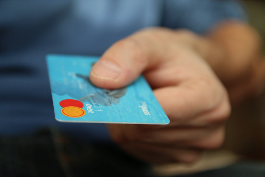
Definitely avoid using stock images on your product landing page — there are many reasons why stock images are bad for your visitor’s user experience, including authenticity and laziness.
Image credit: Pexels
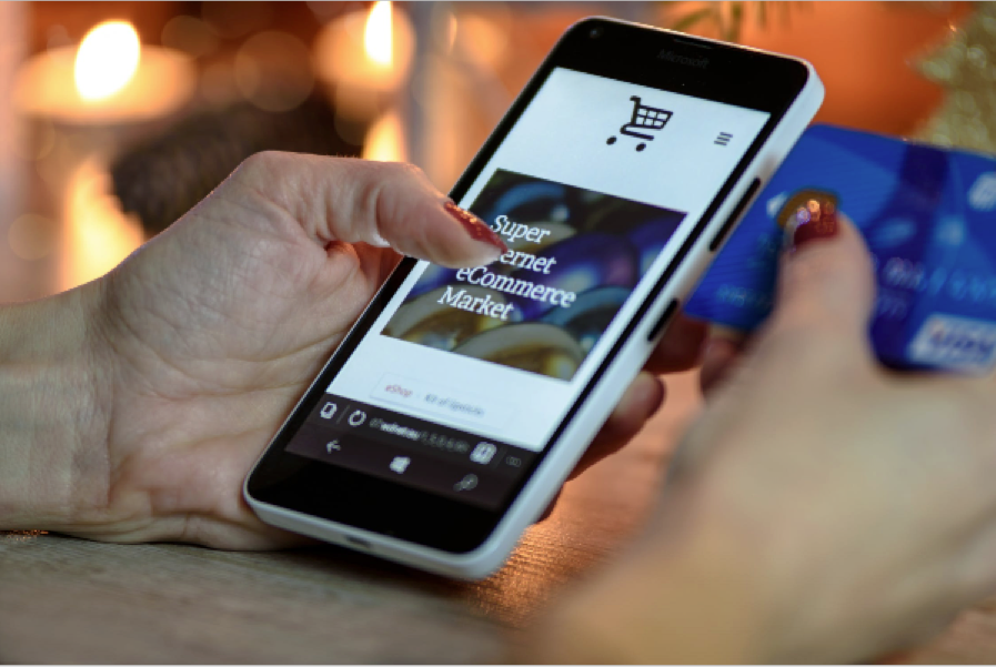
Be mobile friendly. If you’re running an ecommerce website, you must ensure that the customer journey will convert well to a mobile device. Mobile users are a huge chunk of your potential customers: in the last 6 months, 62% of smartphone users have made a purchase online using their mobile device.
Have stylistic consistency.
Don’t go crazy with lots of different colors, shapes, and fonts… Stick to one color scheme and no more than 2 fonts on your product landing page. Uniformity will make your brand appear more trustworthy and professional, and will drive conversion.
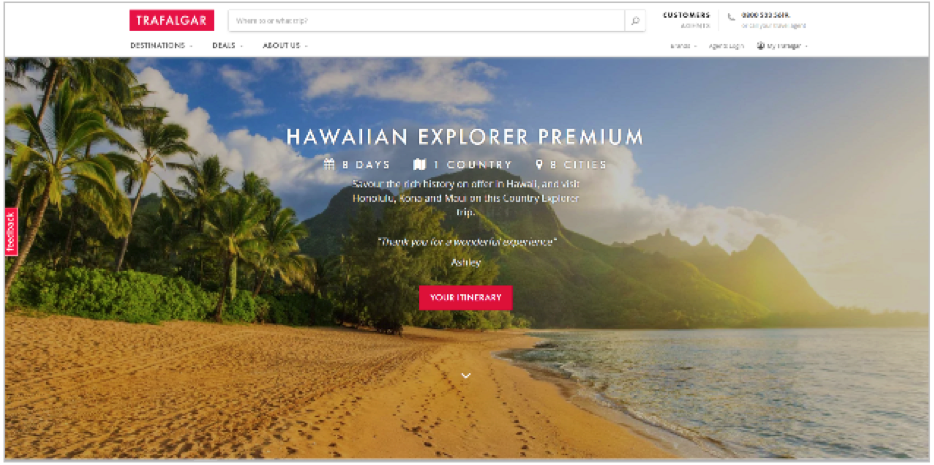
A great example of all of the above is this product landing page from travel brand Trafalgar:
This product page gives plenty of digestible information about the trip itinerary without being too overwhelming, and is sure to space out this information — accompanied by high-quality, relevant images. Trafalgar have stuck to a consistent stylistic theme, keeping to only a few fonts and including plenty of white space too.
Write concise, killer content
More and more of ecommerce marketing budgeting is going on content marketing these days. That’s because everyone’s realised it’s really important — great copy converts leads to sales.
Keep the copy on your product landing page concise and convincing. Your aim is to get the visitor to buy your product or your service, so you need to include information about your product and why it’s so great.
Aim to be informative, but also emotive and engaging.
Your content always needs to be grammatically correct with the right punctuation. If your content is poorly written and unprofessional, why would your potential new customer trust your product? If they can’t trust you to write a bit of content on the internet, why would they trust you to sell them a strong, quality product?
Use your content to emphasize your value proposition. Your would-be customers need to know what makes your product different from those of your competitors. What is your USP? Use your content to emphasise this and draw attention to this on your product landing page.
Use personalization elements (if possible)
What’s better than well-optimized content? Well-optimized content that also contains elements unique to the reader. Just as someone is more likely to be persuaded by a sales assistant who knows them, their guard will be lowered somewhat if they’re made to feel that they’re getting an individual experience.
At a minimum, you can always work in a visitor’s location, though whether that’s appropriate will depend on the type of product you’re selling. You might, for instance, be able to make a point about what kind of shipping is available, detecting when a visitor is in an area that will allow next-day shipping and dynamically pointing it out.
If your product is something that can be customized or worn in some way, then you can also include some kind of preview feature. When you can’t test out a product in person, it helps a lot to be able to bridge that experiential gap to some extent. (If you’re selling sunglasses, for example, you could allow the reader to upload an image of their face and get a preview of how they’d look wearing them.) This ties into a wider trend called experiential retail.
This is something you’ll see a lot in the clothing industry, because the basic products are cheap to manufacture and similarly cheap to customize. The solidity of the model is the main reason why there are so many print on demand businesses for sale online throughout the world (browse the business listings in Miami and you’ll see plenty of them) — with the fundamental operation set up, you can generate a huge amount of business using a generic inventory, so it’s relatively easy to turn a profit.
The value isn’t truly in the item, but in how the buyer perceives it.
Image credit: Pexels
Have a strong call to action (CTA)
Having a strong and clear call to action (CTA) is one of the most important parts of your product landing page.
This is the point when you are literally converting your traffic into sales.
You need to make sure that your CTAs are highly visible, and well as clear and consistent.
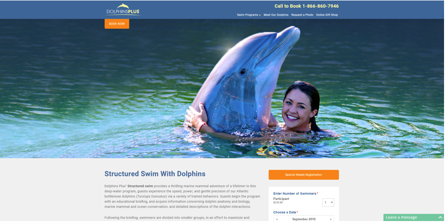
If you’ve got a few CTAs on your product page, keep an eye-catching color (and font) theme so that they are easily distinguishable from the rest of your content. Check out this example from Dolphins Plus, a tourism company who offers dolphin experiences:
The CTAs are both orange, and stand out from the rest of the page.
Do not complicate things by having too many calls to actions. At the end of the day, you want visitors to the site to do one thing on this product landing page: buy this product.
If you have more than a couple of CTAs, you will end up with a muddled user journey and visitors disappearing off to different pages. You’re essentially distracting your visitors from the main purpose of this product landing page.
Your CTA should be funneling your visitors down to the end of the journey — buying your product. Make your call to action persuasive and unmissable.
Include trust indicators and online reviews
Have a trust indicator on your product landing page, like reviews, awards or testimonials.
Include some positive reviews or trustworthy customer testimonials on your product landing page; testimonials are proven to increase conversion rates on landing pages.
You can increase your trust in other ways too: giving your customer a guarantee, like a 30-day return window for a full refund makes them far more likely to buy your product.
Creating the perfect landing page is one of the most important parts of your ecommerce website. Follow our advice to give yourself a head-start: research the market, spend time on creating a great sales page layout and high-quality persuasive copy. Choose images and designs wisely, and always include a bold, visible call to action, as well as trust indicators. And of course, once your Landing Page is complete, you will need to help drive traffic to it with paid search, social media, emails or other promotions based on your marketing plan.
Use these pro tips for a simple way of increasing your conversion rates and boosting those sales. Or, if you need help with your landing pages, check out these top E-Commerce Design & Development Companies on DesignRush.